Monday 23 November 2009

Music Magazines


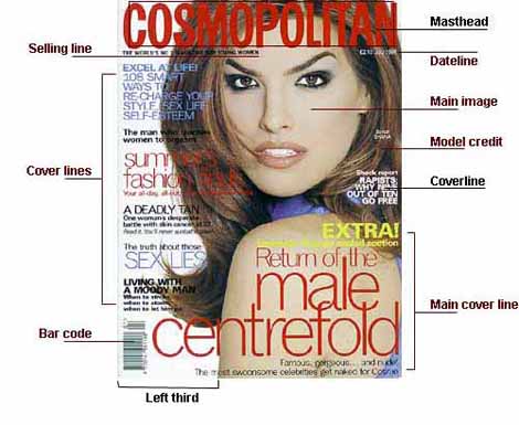
I am now going to compare the conventions of these music magazines: SPIN, VIBE and NME.
The language of the SPIN magazine consists of the masthead in the top left corner of the front page which happens to be slightly covered on both covers. This suggests that the institution of the magazine is a well known company. The colour scheme is also similar as it mainly is a white background however the sub contents vary in colour from pale blue, grey and black to navy blue and black. The main image of these magazine both include a mid shot of the singing artists with a big main sub content highlighting the name of the artist 'Duffy' and the band 'Panic at the disco'.
The institution of SPIN magazines is to inform its audience of the latest music and artists by doing this they have their own website http://www.spin.com/. With links on it which include magazine, reviews and news therefore the purpose is to keep people updated on the latest news in the music industry.
The Ideology of the spin magazine is to apeal to a music target audience as the sub contents contain of artists names and band names, also the bright background might connotate artists that are currently in the music lime that.
The audience of the spin magazine will have a strong interest in music and will be around the age of 15-25 because the artists included aim to sell their music to this age group.
The Vibe magazine has a larger masthead which crosses the top of the magazine, unlike the SPIN magazine this masthead doesn't consist of the same colour in each issue as the ones above include a red/black masthead and a pale blue masthead, again the masthead is slightly covered up by the artist on the front showing me that the company is well known and doesn't have to be completely visible to be identified. The main image shot varies aswell from a medium shot to a medium close up, I think this is done because the medium close up shot concentrates more on kanye's west expression looking rather cocky and confident, whereas the medium shot concentrates more on Eminem's body language (arms crossed) showing hes confident. The colour scheme is fairly basic they both have a big white background, with the sub contents in the same colour as the masthead.

Tuesday 10 November 2009

Q Magazine

The Q music magazine has many conventions which relates them all in a certain significant way. For example the main image dominates the majority of the front cover in an effective way; as this creates a relationship with the band or artist on the front cover, this is because they are always giving the audience eye contact. Also the artist is always well known because it will attract the audience to buy the magazine and read about what the artist is up too in the music industry. The main image is usually either a medium shot or a medium close up as the audience will be able to identify the artist/band easily on the front cover. They are also many subtitles across the page in a big and bold font, they mostly state other artists that are in the magazines, for example if madonna isn't really liked by some people then the artic monkeys sub content might grab their attention and persuade them to buy. The sub contents are also in the colour of the Q magazines logo (red and white). The barcode consists of the price of the magazine and the date it is released to the public.

Q music magazine


Monday 9 November 2009

LIIAR

Language (Magazine Terminology)

  • Masthead
  • Dateline
  • Title
  • Main image
  • Colour scheme

Institutions

  • Create media texts
  • Control language

Ideology (ideas, values, beliefs)

  • The values that the media text conveys

Audience - can be classified by:

  • age
  • wealth
  • occupation
  • interests
  • groups

Representations (how are groups/issues/individuals potrayed?)

  • Representations convey on Ideaolgy

Friday 6 November 2009

Presentation of my work

The presentation of the research, planning and evaluation may take the form of any one, or combination of two or more, of the following:
-A presentation using slideshow softwar such as powerpoint;
-A blog
-A podcast;

Brief:

Main Task: the front page, contents and double page spread of a new music magazine. All images and text used be original, produced by me - with a minimum of four images.

College Magazine Evaluation

Evaluation

For my media assignment I produced a college magazine using Adobe Photoshop as my main resource and putting my images and typography onto a publisher document.
The strengths of my magazine are that the masthead is in purple and white which connotates wyke sports as the football teams kit is purple and white. Therefore this attracts my target audience of 16-19 year old male students, as they will have an interest in sport.
Another strength of my front cover is that I used effective sub contents on the which makes the audience want to read the magazine. I decided to use the font san serif because from my typography research I discovered that this is the most effective font to use because it provides a good contrasts and doesn’t overwhelm the audience with too many fonts. This appeals to the target audience because a formal college magazine with teenage audience shouldn’t have big colourful bubble writing.
The last strength of my magazine is that I used all conventions of a magazine front cover which I used by looking at a labelled magazine in my research. I used a selling line under the mast head to draw the audience in, and the date close to the mast head because that’s where most magazine’s date is found. I used a second smaller image because a few college magazines I looked at had a smaller image on to go with a less important content on the front cover.
I believe a weakness of my magazine is that I tried to include a female audience in my magazine by having netball at the top of the page however I’ve now realised this is not enough to draw females in to the magazine.
For inspiration I looked at sports magazines like 442 and match this helped me decide what I needed on my magazine for my target audience. It also help me decide on some sub contents. I also looked at some college magazines which help me decide the colour scheme because college magazine don’t have too many colours on the front cover so I decided to stick with 3 main colours of white black and purple this colours will appeal to my target audience because they are not too bright which little kids like, as shown in my research in the match magazine. For my image I took a medium close up of a football player in the sports kit which contrasts well to the typography I used and the background colour scheme. In my research I also looked at fashion magazines because I believed this is the best way to find some medium close up shots.
To improve my magazine I could of made my main image slightly larger because it doesn’t stand out from a distance so it might not be that appealing. Also I could of spent more time on the mast head because the sports part is quite blurry around the outer glow therefore it lacks that professionalism. Lastly I should of included more female sports on my front cover as the target audience is for both genres of college students.

Thursday 15 October 2009

Camera angle shots

The main camera angle used on magazine front covers is medium close ups. These are the most affective shots for magazine front covers because it helps people identify what the magazines about. For example magazines can show off clothes on a pretty elegent woman which is easy noticable and the clothes can be recognised by the audience, the person in the shot gives their full eye contact which draws the audience in and communicates with them. Another example is football magazines like four four two; they tend to have a footballer on the front cover in medium close up; who although isn't avdertising fashion, there football kit can be identified easily in the medium close up or there training up rather then if it was a long shot or an extreme close up on the face. Therefore if I have in my college magazine a football player on the front cover I should make sure I get the top in therefore it becomes clear he is part of the college team I should also make sure the main story of the magazine is about the football team.

Typogrpahy Tutorial

http://www.youtube.com/watch?v=sJ8MMec7mV0&feature=related

This tutorial will help me make some colourful and effective text on my college magazine front cover through the form of typography.

Typography and Desktop Publishing

Typography is the design and use of typefaces as a means of visual communication from calligraphy to the ever-developing use of digital type is the broad use of the term typography. However, the art and practice of typography began with the invention of moveable type and the printing press. Typography is sometimes seen as encompassing many separate fields from the type designer who creates letterforms to the graphic designer who selects typefaces and arranges them on the page.
The art of typography focuses on the characteristics of a typeface, the shapes of the individual characters, and the aesthetics of a particular font. Text composition deals with how fonts are arranged on the page. It involves manipulating text placement and altering the visual appearance of the text.
Desktop publishing is the process of arranging text and graphics on the page and producing a file for printing. Typographic or text composition is a step in that process that takes the text and ensures that its appearance is appropriate and that it enhances the overall page composition. Text composition involves numerous individual tasks that break down into four general areas: placement, style, spacing, and embellishment.
Desktop publishing is about combining text and graphics. On the text side, designers use fonts to make the text look good. There are specific tried and true methods of using type in desktop publishing to accomplish the designer's goals. These practical typography tutorials include:
• How to choose the right fonts
• How to use expert characters including diacriticals and ligatures
• How to improve legibility and readability
• How to arrange type on the page, with or without accompanying graphic elements
• How to use typography creatively to communicate more than just the basic meaning of the words


Helpful Source:-http://desktoppub.about.com/od/typetutorials/Practical_Typography_Tutorials.htm

Guidlines to HELP me use Typography

  • Use Serif Text with Sans Serif Headline - When in doubt, pair a serif font for body text and a sans serif font for headlines.
    This is not a rule. This is simply a good starting point for when you're stuck for ideas or can't seem to find the right mix. In most cases a serif plus a sans serif provides good contrast and doesn't overwhelm with too many fonts.
  • Use Contrasting Styles - Avoid mixing two very similar typefaces, such as two scripts or two sans serifs. There is not enough contrast and the small differences will cause a visual clash.
    This is one reason that pairing a serif with a sans serif font works so well. There's generally good contrast
  • Use Fewer Fonts - Limit the number of different typefaces used in a single document to no more than three or four.
    With too many different fonts you run into problems with not having enough contrast between similar font styles plus a lack of consistency and even a feeling of choppiness because there are too many distractions. Using just one typeface can be better than two or three or four or more.
  • Use Proportional Fonts - Avoid monospaced typefaces for body copy. They draw too much attention to the individual letters distracting the reader from the message.
    The best body copy fonts are the least distinctive. They generally have less extreme parts or unusual character shapes. This is one place where boring can be better. Use fonts with more distinctive characters in headlines and pull-quotes and other places where you want to grab attention and pull the reader into the story

Target Audience

The target audience of a magazine can be easily identified from the front cover. For example a match magazine's target audience is for 7-12 year olds, which is apparent in the colours used, as match magazines used bright eye catching colours like the bright yellows and reds. Also it consists of many pictures on the front cover and the sub contents are scattered all over the page in different colours and different angles; it shows of a young playful side to the magazine therefore it appeals to its target audience and doesn't look too formal and boring for children.


The four four two magazine has an older target audience of teens to young adults. From the front cover alone i know the target audience is older then the match magazine this is due to only one main image and a little one in the top right, whereas the match magazine has images at the bottom down the right and at the top of the page. This shows a more formal approach to four four two's audience. Also the sub contents in the four four two magazine are bold but are just yellow and white other then the match magazines blue yellow black white and red sub contents; they are also on a horizontal angle which doesnt give off a relaxed and young vibe off as the match magazines sub contents do. Laslty both magazines main image cover part of the title i believe this is because they are well known and easily identified despite being covered slightly however since my college magazine is not as popular i have decided not to cover part of my college magazines title.

Wednesday 14 October 2009

Images

There is usually one main image on a magazine front cover; the images used always represents the genre of the magazine for example the men's health magazine has a man with his top off and a 6 pack and a girl with her arms around him this shows to the target audience that the man is healthy and looks after himself and as a result he gets a beautiful woman. Therefore pictures can be used to grab the audience attention aswell as relating to the magazines genre.
I have looked at several college magazines withing my research and they all had the same layout with a big bold masthead; 3 sub contents at the top of the page; a big main image; and a smaller image at the top of page beside the sun contents. These magazines had a theme of a white background with green/blue/orange writing. The sub contents seemed to be more organised then on other magazines i believe this is because college is a more formal subject then fashion and mens health. Therefore i should not scatter sub contents across the page when i make my own front cover and only have two pictures max with a simple theme which coule be repeated.

Barcode

The bar code on a magazine front covers tends to be out the way at the bottom left of the page; this is purposely done to avoid crossing any sub contents which are effective for grabbing the attention of the target audience; or the image which relates too and represents what the magazine is about or most importantly the magazines masthead otherwise it may be hard for people to identify the magazine. Therefore it is effecient for the majority of magazines to have the barcode in the bottom left of the page.
This image shows how the barcode is well out the way off any main aspects of a magazine front cover.

Date

From looking at several magazine front covers; it has become apparent that the most common place for the date on a magazine front cover is just below the masthead this is because people who buy the magazine will straight away look at the masthead, therefore if the date is below it then it educate people immediately on whether its a new magazine or not.

Labelled Magazine

This picture of a labelled magazine front covers shows me the main aspects of what is included in magazines therfore this will be helpful for the planning of my magazine front cover. It will also assure me i dont miss any important aspects out of my magazine front cover.

Friday 9 October 2009


The men's health magazine shows the conventions of a magazine front cover; it includes a big bold eye catching title, the date just below the title in a small font.

Also it includes a large image in the centre of the page which relates to the name of the magazine as it shows the audience to what looks a healthy man.

Dotted around the front cover are bold sub contents which make you want to buy the magazine and read about how they can build a total home gym for £44 for example. The sun contents vary in size as maybe some are used to catch the audiences eyes more than overs. They also vary in colour

This will help me produce a magazine front cover on photoshop:-

http://www.youtube.com/watch?v=I1VThwTPTnQ&feature=fvw

Monday 28 September 2009

Conventions of a Contents page

  • Bold title to show the audience whats on the page.
  • Page numbers to show what contents are on what page
  • Pictures to show whats on some pages to draw the readers in to that page.
  • Subscriptions to attract the audience to the offers in that magazine
  • Regulars - The parts of the magazine that are in every week such as an agony aunt
  • A simple layout - if the layout is too complex it may be difficult for the audience of the magazine to read therefore they might find it difficult to find contents to their allocated page number.

Conventions of a magazine front cover

The conventions of a magazine:-
Big bold title of magazine - Tells the audience what its called, what type of magazine it is, title must be easily recognisable.
Date - Usually in small print in the corner of the magazine.
Pictures - Main picture to go with main subject, 1 small picture somewhere else on the cover to go with a sub content.
Sub content titles - Seem to be grouped together on part of the front cover, a picture may accompany.
Main subject - Includes a large picture, the main focus when you look at the magazine, makes you want to buy it.
Colours - Show what is included in the magazine or the type of magazine. For example, dark colours are usually on a gaming magazine, bright colours on a tv magazine.
Preliminary exercise: using DTP and an image manipulation program, produce the front page of a new school/college magazine, featuring a photograph of a student in medium close up plus some appropiately laid-out text and a masthead. Additionally you must produce a mock-up of the layout of the contents page to demonstrate their grasp of DTP.

Main Task: the front page, contents and double page spread of a new music magazine. All images and text used must be orginal, produced by you - minimum of four images.