The four four two magazine has an older target audience of teens to young adults. From the front cover alone i know the target audience is older then the match magazine this is due to only one main image and a little one in the top right, whereas the match magazine has images at the bottom down the right and at the top of the page. This shows a more formal approach to four four two's audience. Also the sub contents in the four four two magazine are bold but are just yellow and white other then the match magazines blue yellow black white and red sub contents; they are also on a horizontal angle which doesnt give off a relaxed and young vibe off as the match magazines sub contents do. Laslty both magazines main image cover part of the title i believe this is because they are well known and easily identified despite being covered slightly however since my college magazine is not as popular i have decided not to cover part of my college magazines title.
Media Coursework
- Magazine Front Cover and Contents Page
- Deadline: Friday 23rd
Thursday, 15 October 2009
Target Audience
The four four two magazine has an older target audience of teens to young adults. From the front cover alone i know the target audience is older then the match magazine this is due to only one main image and a little one in the top right, whereas the match magazine has images at the bottom down the right and at the top of the page. This shows a more formal approach to four four two's audience. Also the sub contents in the four four two magazine are bold but are just yellow and white other then the match magazines blue yellow black white and red sub contents; they are also on a horizontal angle which doesnt give off a relaxed and young vibe off as the match magazines sub contents do. Laslty both magazines main image cover part of the title i believe this is because they are well known and easily identified despite being covered slightly however since my college magazine is not as popular i have decided not to cover part of my college magazines title.

Wednesday, 14 October 2009
Images
There is usually one main image on a magazine front cover; the images used always represents the genre of the magazine for example the men's health magazine has a man with his top off and a 6 pack and a girl with her arms around him this shows to the target audience that the man is healthy and looks after himself and as a result he gets a beautiful woman. Therefore pictures can be used to grab the audience attention aswell as relating to the magazines genre.
I have looked at several college magazines withing my research and they all had the same layout with a big bold masthead; 3 sub contents at the top of the page; a big main image; and a smaller image at the top of page beside the sun contents. These magazines had a theme of a white background with green/blue/orange writing. The sub contents seemed to be more organised then on other magazines i believe this is because college is a more formal subject then fashion and mens health. Therefore i should not scatter sub contents across the page when i make my own front cover and only have two pictures max with a simple theme which coule be repeated.
Barcode
The bar code on a magazine
front covers tends to be out the way at the bottom left of the page; this is purposely done to avoid crossing any sub contents which are effective for grabbing the attention of the target audience; or the image which relates too and represents what the magazine is about or most importantly the magazines masthead otherwise it may be hard for people to identify the magazine. Therefore it is effecient for the majority of magazines to have the barcode in the bottom left of the page.
This image shows how the barcode is well out the way off any main aspects of a magazine front cover.
Date
From looking at several magazine front covers; it has become apparent that the most common place for the date on a magazine front cover is just below the masthead this is because people who buy the magazine will straight away look at the masthead, therefore if the date is below it then it educate people immediately on whether its a new magazine or not.
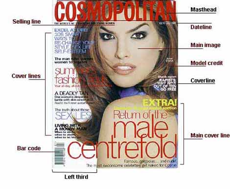
Labelled Magazine
Friday, 9 October 2009
The men's health magazine shows the conventions of a magazine front cover; it includes a big bold eye catching title, the date just below the title in a small font.
Also it includes a large image in the centre of the page which relates to the name of the magazine as it shows the audience to what looks a healthy man.
Dotted around the front cover are bold sub contents which make you want to buy the magazine and read about how they can build a total home gym for £44 for example. The sun contents vary in size as maybe some are used to catch the audiences eyes more than overs. They also vary in colour
This will help me produce a magazine front cover on photoshop:-
http://www.youtube.com/watch?v=I1VThwTPTnQ&feature=fvw
Subscribe to:
Posts (Atom)